
One of the biggest stumbling blocks some of us face when starting a new quilt is choosing the colour scheme. With colours you can set a mood, attract attention, or make a statement. Colour can be your most powerful design element if you learn to use it effectively.
Often we go looking for inspiration in the environment that surrounds us, whether that be naturally or digitally motivated. But what makes us choose particular colour schemes? What makes them appealing to us?
Today we are going to break down 6 simple, universally accepted, colour “rules” to help you understand the mechanics behind your intuition.
At the end of this explanation we’ll give you an exercise to practise your new found colour confidence. We hope you will donate this to the Perth Modern Quilt Guild so we can use them to make some charity quilts … you get colour confidence, someone in need gets a quilt!
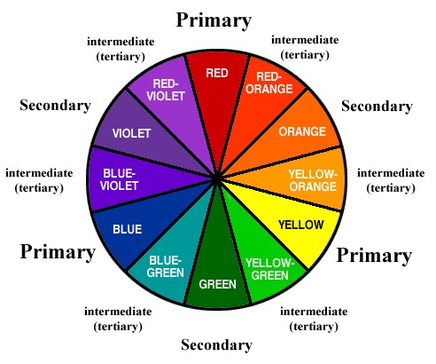
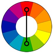
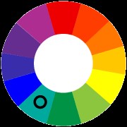
Ok, so here’s a colour wheel to refresh your memories on Primary, Secondary and Tertiary colours. (You can also refer to our previous blog post).
Let’s play with these colours and create some tried and tested colour schemes.
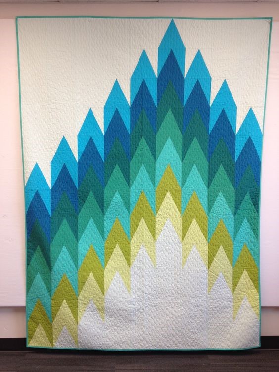
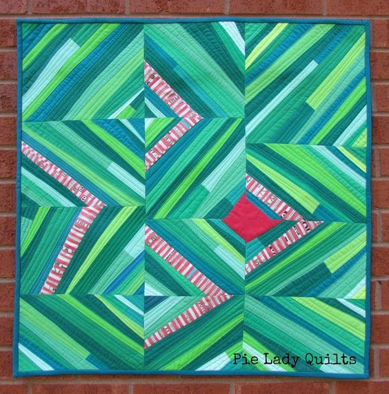
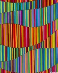
First cab off the rank is Analogous (pronounced “an-al-o-gus”)
Analogous colour schemes use colours that are next to each other on the colour wheel. They are harmonious, are often found in nature and create serene and pleasing to the eye designs.
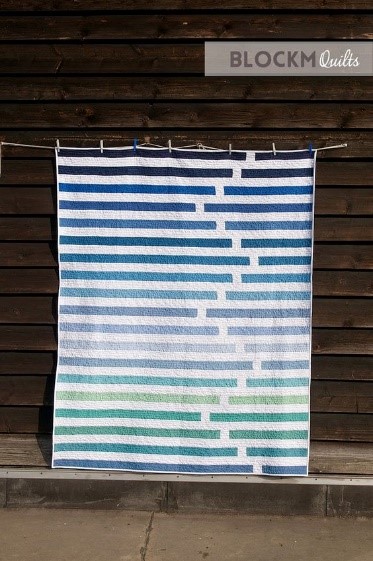
Strip quilt source https://www.pinterest.pt/pin/187110559501822279/
Arrow head quilt source https://www.pinterest.pt/pin/187110559501822290/
Just make sure you have enough contrast when choosing an analogous colour scheme to keep your audience interested.
Next we have the Complementary colour scheme
These are colours that are opposite each other on the colour wheel.
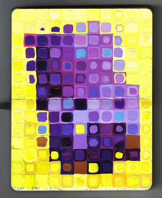
Purple and Yellow painting https://www.pinterest.pt/pin/187110559501821893/
Red and Green mini https://www.pinterest.pt/pin/187110559501822377/
The high contrast of complementary colours creates a vibrant look especially when used at full saturation. This colour scheme can be jarring when used in large doses, but works well when you want something to stand out.
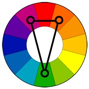
Split complementary colour scheme
This is a variation of the complementary colour scheme. In addition to the base colour, it uses the two colours adjacent to its complement. Clear as mud? Here’s a picture:
Triangle quilt source https://www.pinterest.pt/pin/187110559497428500/
Ahh that’s better … so if you’re choosing Green as your base colour, ditch its complementary colour “Red” and go for Red’s neighbours, “red-violet and “red-orange”, instead. Oh the sweet poetry of colour.
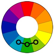
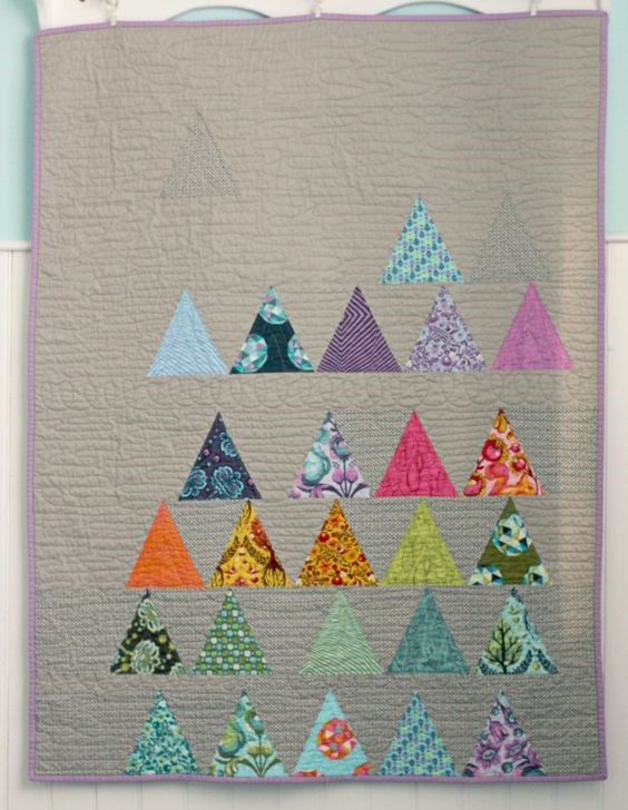
The Triad (or Triadic) colour scheme uses colours that are evenly spaced around the colour wheel. Again better said with a picture …
Pattern source https://www.pinterest.pt/pin/187110559501821954/
To use a triadic harmony successfully, the colours should be carefully balanced – let one colour dominate and use the other two to accent.
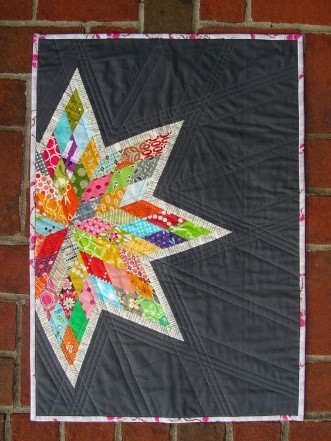
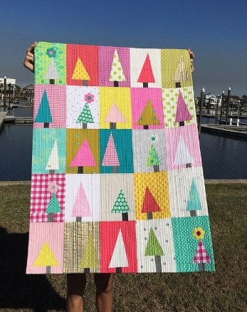
Now for the big guns … Square and Tetradic colour schemes … these use two sets of Complementary Colours! Whaaaat?? I know right?!
The Square colour scheme uses “evenly spaced” Complementary colours (remember these are colours opposite to each other on the colour wheel).
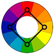
The Tetradic colour scheme uses two sets of complementary colours too but set in a rectangle shape … I feel a graphic coming on …
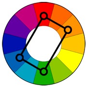
Both of these methods help you to balance warm and cool colour tones in a way that really pops!
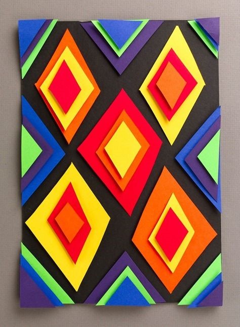
Diamonds source https://www.pinterest.pt/pin/293085888236107666/
Star quilt source https://www.pinterest.pt/pin/450360031479321029/
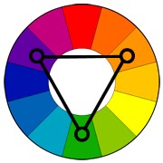
Trees source https://www.pinterest.pt/pin/AX5bCBaBGd8GZapsIkT9-eyhMdXoVCnoEsDi4qi-Gp91B2TRvyh8IUc/
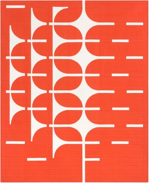
Last but definitely not least is the Monochromatic colour scheme which uses only one segment of the colour wheel. You can vary the lightness or darkness of your chosen hue (colour) … or stick to one shade only to pack a punch.
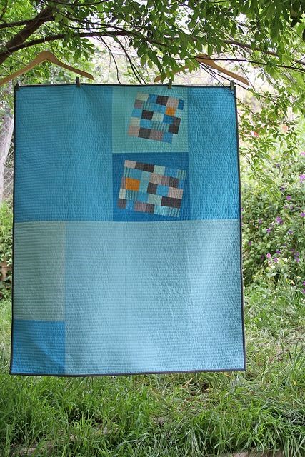
Blue quilt https://www.pinterest.pt/pin/116389971590511713/
Orange quilt source https://www.pinterest.pt/pin/454441418643209761/
Challenge
So over to you!
We’ll keep it easy and ask you to concentrate on the first two colour schemes – Analogous and Complementary.
Please sew one “strip set” using an Analogous colour scheme and one set using a Complementary colour scheme by following these steps:
- Select your fabric, can be prints or solids (for these instructions we’re going with solids and an Analogous colour scheme)
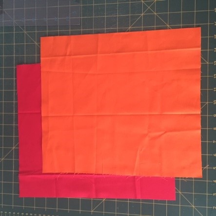
2. Cut each fabric to measure 11.5” x 13”
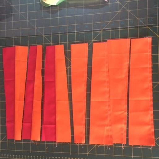
3. Lay the fabrics on top of each other, both fabrics facing right sides up.
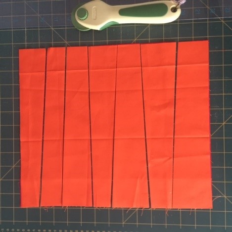
4. Cut fabrics (one on top of the other – the red fabric is under the orange fabric) into wonky strips, each strip should be larger than 1” at the narrow end.
5. Sew strip pairs (orange and red) together.
6. Then sew the pairs together to make one long strip piece.
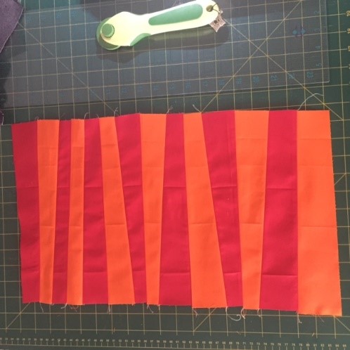 7. Don’t worry about trimming them … we’ll do that when we try and work out how to piece them all together!
8. Repeat all of the above for your Complementary colour scheme block.
9. When you are done … please post a photo of your two blocks to our members only Facebook group here: https://www.facebook.com/media/set/?set=oa.1833054743372613&type=3
… and … please bring them to the PMQG Sit and Sew day on either 11th February or 25th February 2018, so we can turn them into a bright and happy charity quilt (or two!).
Thank you for your support and we hope you’ve enjoyed learning a little bit more about colour.
Education.